Archived content. This page is no longer actively maintained and may not function as intended. For the latest information and statistics visit the ABS Website.
Health in Australia has progressed over the last decade
Indicator: Life expectancy at birth
Why is this theme important?
Australians told us that being healthy was one of the most significant factors affecting an individual’s wellbeing. While health conditions and disabilities will always exist, people felt that it was still possible for people to optimise their health and have a feeling of wellness. Health was seen as multidimensional, relating not just to someone’s physical condition but also to their mental, emotional and social wellbeing. Lifestyle factors and the living, working, urban and natural environments also play an important role in health for Australians. The health of individuals was seen to affect relationships, particularly those relationships associated with caring for people who are ill, elderly or have disabilities. Wider social and community wellbeing can also be influenced by health. For example, the provision of quality health care services and programs can impact community health and cohesion. Many people in the consultation saw society as having a collective responsibility to plan for the costs of providing adequate health care.
Good health improves the wellbeing of individuals and the broader community through direct and indirect means. For an individual, good health means a life free of the burdens of illness, which can include pain, social isolation, financial costs, and restrictions to lifestyle choices. For the nation, a healthy population is more able to contribute to society in various ways, such as through participation in employment, education and social or community activities. A good level of health also brings about reduced direct costs to the community, such as through lower health care costs and reduced death rates.
Why has there been progress?
Health in Australia has progressed over the last decade because continuous improvements in life expectancy at birth (our headline progress indicator for health) suggest there has been progress.
In the ten years to 2012, life expectancy at birth has improved by 2.5 years for males and 1.7 years for females. Based on current mortality rates, a male born in 2010-2012 can expect to live 79.9 years, while a female can expect to live 84.3 years. Over the decade, male life expectancy increased more than female life expectancy (2.5 compared with 1.7 years). This saw the gap between the sexes’ life expectancy decrease to 4.4 years, a change of almost one year over the decade.
Why this headline progress indicator?
Living a long and healthy life is an important part of the aspiration for health.
Life expectancy is considered a good measure of progress for health because it is one of the most widely used and internationally recognised indicators of population health. It focuses on the length of life rather than its quality, but provides a useful summary of the general health of the population.
Physical health in Australia has progressed since 1998
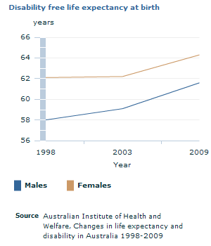
Indicator: Disability free life expectancy at birth
Why is this element important?
Physical health has been identified as an important contributor to maintaining good overall health. Good health means a life free of the burdens of illness, which can include pain, social isolation, financial costs, and restrictions to lifestyle choices.
We have decided that physical health in Australia has progressed since 1998 because disability free life expectancy at birth (our progress indicator for physical health) has increased.
Since 1998, disability free life expectancy at birth for males and females has steadily increased from 58 years and 61.6 years respectively, to 62.1 years and 64.3 years in 2009.
Why this progress indicator?
The expectation of living a long and disability free life is an important part of the aspiration for health.
Disability free life expectancy is considered a good measure of progress for physical health because it indicates the length of time people can expect to live without restriction to their day-to-day physical function or activity as a result of disability. As the headline indicator for health 'life expectancy' shows, Australians are living longer, and this progress indicator for physical health informs us about an aspect of the quality of life experienced. Having a disability does not necessarily equate to poor health or illness, and expected years with disability should not be considered as being of less value than expected years without disability.
This indicator is a partial measure of physical health.
The data source is of acceptable quality.
But that is not the whole story...
There is more to health than physical health. Look through the other tabs on this page to see if the other elements of health have progressed.
Check out our further info page for useful links, a glossary and references relating to this chapter.
Footnote(s): (a) Levels of psychological distress are derived from the Kessler Psychological Distress Scale. Denominator includes a small number of persons for whom levels of psychological distress were unable to be determined or who were not asked. (b) Persons aged 18 years and over. (c) A score of 22 or more on the Kessler Psychological Distress Scale (K10).
;(a) Levels of psychological distress are derived from the Kessler Psychological Distress Scale. Denominator includes a small number of persons for whom levels of psychological distress were unable to be determined or who were not asked. (b) Persons aged 18 years and over. (c) A score of 22 or more on the Kessler Psychological Distress Scale (K10).
;(a) Levels of psychological distress are derived from the Kessler Psychological Distress Scale. Denominator includes a small number of persons for whom levels of psychological distress were unable to be determined or who were not asked. (b) Persons aged 18 years and over. (c) A score of 22 or more on the Kessler Psychological Distress Scale (K10).
Mental health and wellbeing in Australia has progressed over the last decade
Indicator: Levels of psychological distress
Why is this element important?
Health is multidimensional, relating not just to someone's physical condition but also to their mental, emotional and social wellbeing.
Mental health is a state of psychological, emotional and social wellbeing and is an important part of the aspiration for health. Mental health is fundamental to the wellbeing of individuals, their families and the population as a whole.
We have decided mental health and wellbeing in Australia has progressed since 2001 because the levels of psychological distress (our progress indicator for mental health and wellbeing) have decreased.
Between 2004-05 and 2011-2012, there has been a steady decrease in high/very high levels of psychological distress experienced across most age groups. An exception to this trend was a lack of change in the 18-24 age group over the last 4 years which remains steady at 12%.
Why this progress indicator?
Mental health is a state of emotional and social wellbeing and is an important part of the aspiration for health.
Levels of psychological distress measure a person's emotional state 4 weeks prior to being asked about it in the ABS National Health Survey. This is considered a good measure of progress for mental health and wellbeing as there is an association between high psychological distress and mental health conditions.
This indicator is a partial measure of mental health and wellbeing.
The data source is of high quality.
Let's break it down!
In the ten years to 2011, there has been a steady trend where men are reporting lower levels of psychological distress than women and are less prone to experience high/very high levels of distress. In 2001, 69% of men and 60% of women were reporting low distress levels. In 2011-12 this trend continued, with the percentage of men experiencing low levels of distress still higher than women, 73% and 67% respectively.
The percentage of men experiencing high/very high levels of distress in 2001 was only 10% compared to women at 15%. Again in 2011-12, this steady trend remained, with men being less likely than women to experience high/very high levels of psychological distress, 9% and 13% respectively.
Use the drop down menu on the graph to look at other breakdowns of the indicator (graphs are also available on the further info page).
But that is not the whole story...
There is more to health than mental health and wellbeing. Look through the other tabs on this page to see if the other elements of health have progressed.
Check out our further info page for useful links, a glossary and references relating to this chapter.
A data gap currently exists for quality health services
In MAP there are several types of data gaps where:
1. the concept is not yet developed enough to measure;
2. the concept is important for progress but may not lend itself to meaningful measurement;
3. there is no data of sufficient quality to inform on progress; or
4. there is only one data point, so a progress assessment cannot be made.
A range of possible indicators are being considered for quality health services, such as patient experiences in Australia and data about private health insurance. In order to capture the spirit of this idea in a measure, further development will need to be undertaken. We will continue to explore options for a suitable indicator in the future.
But that is not the whole story...
There is more to health than quality health services. Look through the other tabs on this page to see if the other elements of health have progressed.
Check out our further info page for useful links, a glossary and references relating to this chapter.
Footnote(s): (a) Persons aged 18 years and over. (b) Based on measured Body Mass Index.
;(a) Persons aged 18 years and over. (b) Based on measured Body Mass Index.;(a) Persons aged 18 years and over.;(a) Persons aged 18 years and over.
We have decided that a clear progress assessment cannot be made for healthy lifestyles in Australia because the two progress indicators for healthy lifestyles have not moved in the same direction.
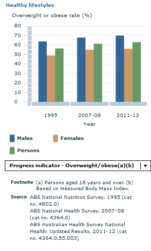
The proportion of adults who are overweight or obese has risen gradually since 1995. In 2011-12, the proportion of adults who were overweight or obese was 63%, comprising 35% overweight and 28% obese, compared with 56% in 1995.
Conversely, the national smoking rate has decreased consistently over the past decade. In 2011-12, 16% of all adult Australians smoked daily (2.8 million people), a decrease from 19% (3.0 million people) in 2007-08 and 22% (3.2 million people) in 2001.
Why these progress indicators?
Both obesity and smoking are significant risk factors in a range of often preventable health conditions and are therefore important aspects of the aspiration for health.
The proportion of adults who are overweight or obese and the proportion of adults who are current daily smokers are considered good measures of progress for healthy lifestyles.
These indicators are a partial measure of healthy lifestyles.
The data source is of high quality.
Let's break it down!
Since 1995, the proportion of adults who are overweight or obese has risen across all age groups. The age group with the largest rise in the proportion of adults who are overweight or obese was the 35-44 years age group, with 65% (comprising 37% overweight and 28% obese) in 2011-12, compared with 57% (comprising 39% overweight and 18% obese) in 1995. In 2011-12, the proportion of adults aged 18-24 year olds who were overweight or obese was 36% (comprising 21% overweight and 15% obese), compared with 32% (comprising 22% overweight and 10% obese) in 1995.
In the ten years to 2011, smoking rates have decreased considerably amongst younger adults, while smaller decreases have occurred at older ages. In 2011-12, 17% of all 18-24 year olds were current daily smokers compared with 28% in 2001, while 20% of all 25-34 year olds were current daily smokers (compared with 30% in 2001). In 2011-12, 9% of all 65-74 year olds were current daily smokers compared with 11% in 2001.
A healthy lifestyle can contribute to a longer life expectancy. Smoking rates for Australia have decreased consistently between 2001 and 2011-12, but this is an example of national data hiding the outcome for smaller areas. Differences exist across areas of Australia, with smoking rates higher in regional and remote areas of Australia than in major cities. While rates have decreased in recent years in regional and remote areas, improvements have been greater in major cities. Further information about progress in rural and remote areas of Australia can be found in our 'Rural and Regional progress' chapter.
It is possible that the decline in smoking rates has occurred as a result of concerted and sustained government tobacco control strategies, such as, increasing taxation of tobacco, advertising bans, mass media public education campaigns and smoke-free environments legislation.
As we have chosen to present two progress indicators for the element of healthy lifestyles, you can use the drop down menu on the graph to look at graphs relevant to each of these indicators (graphs are also available on the further info page).
But that is not the whole story...
There is more to health than healthy lifestyles. Look through the other tabs on this page to see if the other elements of health have progressed.
Check out our further info page for useful links, a glossary and references relating to this chapter.
Footnote(s): (a) An average air quality index (AQI) of 100 or greater means that on average air quality standards have been exceeded. An AQI of 33 or less is considered very good. (b)This indicator takes the average AQI for all measured pollutants within each city, based on median concentrations, and brings them together as an overall average that is weighted by the cities' relative populations.
Healthy environments in Australia have not changed greatly since 2004
Indicator: Average air quality index for capital cities
Why is this element important?
Poor air quality has a range of negative impacts: it can cause health problems, damage infrastructure, reduce crop yields and harm flora and fauna. Air pollution occurs both naturally and as a result of human activities.
How have we decided things haven't changed greatly?
We have decided that there has been little change in the health of Australia's air in recent years because the average air quality index for capital cities (our progress indicator for air and atmosphere) hasn't moved much.
If the average air quality index had declined considerably over the period, this would be considered progress.
Between 2004 and 2010, the average air quality index for capital cities, showed no significant movement. The index was 24 in 2004 and 22 in 2010. These low values meant that on average air quality was very good and air pollution posed little or no risk. (Endnote 1)
Why this progress indicator?
The average air quality index for capital cities is an important part of the aspiration for healthy environments.
The average air quality index for capital cities is considered a good measure of progress for healthy environments because ultimately the best measure of air quality might simultaneously be able to consider the quality of Australia's air across the entire continent and for all relevant pollutants. The measure that we have used goes some way towards doing that, by summarising the average level of several pollutants across capital city 'airsheds' relative to their recommended levels.
However, this indicator has limitations. For example, the indicator uses air quality data from only selected monitoring stations across Australia (though these stations are at the capital cities, where population health may be at a greater risk from poor air quality). A further limitation is that the indicator is an average. Using averages, across many regions, tends to mask trends in the data that might illuminate important stories in more specific areas, or for particular pollutants.
This indicator is a partial measure of healthy environments.
The data source is of acceptable quality.
But that is not the whole story...
There is more to health than healthy environments. Look through the other tabs on this page to see if the other elements of health have progressed.
While this page has focussed on ambient air quality, information on the health of our atmosphere can be found in the 'Climate change' section of Measures of Australia's Progress 2013's 'Sustaining the environment' page.
Check out our further info page for useful links, a glossary and references relating to this chapter. ENDNOTES
1. An air quality index (AQI) can be calculated by dividing pollutant concentrations by standards for maximum allowable concentrations set in the National Environment Protection (Ambient Air Quality) Measure (the ‘NEPM’; available at http://www.comlaw.gov.au/Details/C2004H03935) and multiplying by 100. An index score of 66 or less is considered good, 33 or less is considered very good, while a score greater than 100 is considered poor. The figures used in Measures of Australia's Progress are averaged AQIs of median concentrations for all measured pollutants (carbon dioxide, nitrogen dioxide, ozone, sulphur dioxide, and particle matter).
Measures of Australia's Progress provides an average air quality index for capital cities, weighted by population. This means that each city's AQI contributes to the overall average proportionally relating to its population. For example, in 2010, Sydney's population represented almost one third of the overall capital city population, and therefore its AQI contributed to almost one third of the overall indicator.
Document Selection
These documents will be presented in a new window.

.GIF)
(b).GIF)
 of capital cities.GIF)