6202.0 - Labour Force, Australia, Jan 2012  Quality Declaration
ARCHIVED ISSUE Released at 11:30 AM (CANBERRA TIME) 16/02/2012
Page tools:
 Print Page Print Page
 Print All Print All
| ||
|
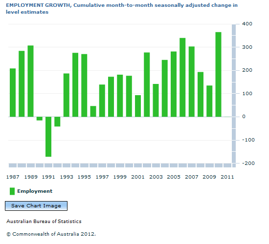
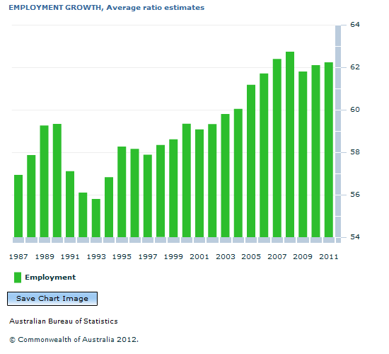
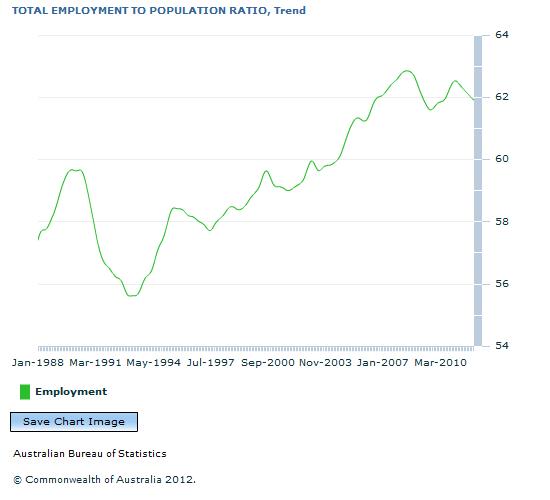
EMPLOYMENT LEVEL ESTIMATES VERSUS EMPLOYMENT TO POPULATION EXPLAINED OVERVIEW Each month the ABS collects data on Labour Force characteristics from about 30,000 households, which roughly equates to 60,000 people. These people live in a broad range of areas and have diverse backgrounds and are considered to be a good representation of the Australian population. From this information, the ABS produces a wide variety of statistics that paints a picture of the labour market. One of the statistics that attracts a lot of attention each month is the estimate for the number of people who are employed. LEVEL ESTIMATES When used in isolation, the employment level estimates, or employment 'head-count', may not reveal any striking dynamics in the labour market; the trend generally increases at a steady rate (see graph below). This is mainly because the number of people that are employed generally increases over time at a similar rate to population growth. Conceptually, this makes sense: as the population grows, so do the number of people who can and do work, as does the number of jobs required to support the increased population. EMPLOYMENT TO POPULATION RATIO An alternative measure that can be more revealing is the Employment to Population ratio. This ratio shows the number of people that are employed as a percentage of the civilian population aged 15 years and over. This measure removes population growth as a confounding factor when interpreting the employment estimates. In doing so, it enables a fair comparison of employment rates at different periods of time. ANNUAL EMPLOYMENT Recent reports have compared the annual growth in seasonally adjusted employment level estimates and have suggested 2011 is the year with the lowest employment growth since 1992 (see below). This neglects consideration that the growth in population estimates for 2011 was also the lowest in over 10 years. It is likely that a large portion of the growth in employment levels in the recent years prior to 2011 has been due to higher levels of population growth. A different method of analysis that removes the effect of population growth is to compare average employment to population ratios for each year. The graph above presents annual comparisons of average employment to population ratios. In 2011, the employment to population ratio (62.2%) was actually 6.1 percentage points higher than the low in 1992 (see below). The ratio in 2011 is the third highest rate of employment in the last 30 years, higher than 2010 and 2009 rates, which were 62.1% and 61.8% respectively. This analysis provides an alternative comparison of employment between years, as the influence of change in the underlying population in each year is removed. MONTHLY EMPLOYMENT In the monthly series, the number of people who were employed, as percentage of the population, increased from 57.4% in January 1988 to 59.7% in May 1990. It then decreased to 55.6% in February 1993 during the recession of the early 1990s, after which it increased to 58.4% in July 1995. The employment to population ratio generally increased to 62.8% in May 2008 when it fell to 61.6% in August 2009 during the 2008-09 financial crisis. It then increased to 62.5% in January 2011 and has decreased to 61.9% in January 2012. Document Selection These documents will be presented in a new window.
|
|

.gif)


